

A serendipitous find led me to write this piece. I don’t think I would be wrong in saying that we all admire beautiful writing, even in the days of digital media and 5 to 8 minute reads. But how many of us would stop to think of the writers – artists to be sure – of the days of yore who wrote long-hand painstakingly, page by page, in swirls and curls of black ink and colour.
I am, of course, talking about the art of calligraphy. It literally means “beautiful writing”.
I recently read an article on My Modern Met about a 16th century manual of calligraphy called Mira Calligraphie Monumenta that the J Paul Getty Museum has now put into common content and which is available as a free download. After reading the piece, of course, yours truly went straight to the Getty Museum site, searched for the book and had a look. I wasn’t going to miss this for anything. And what a find it was!
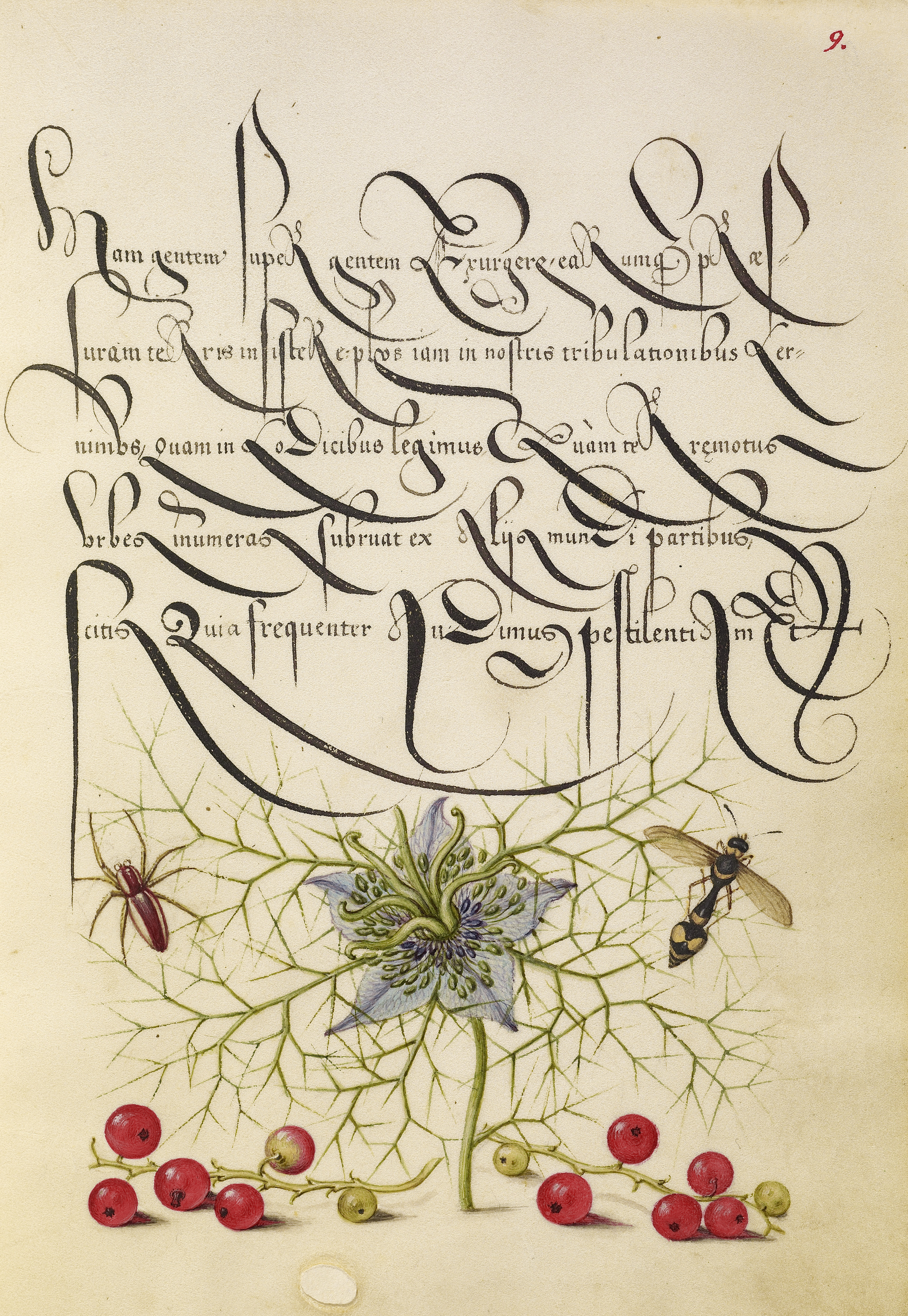
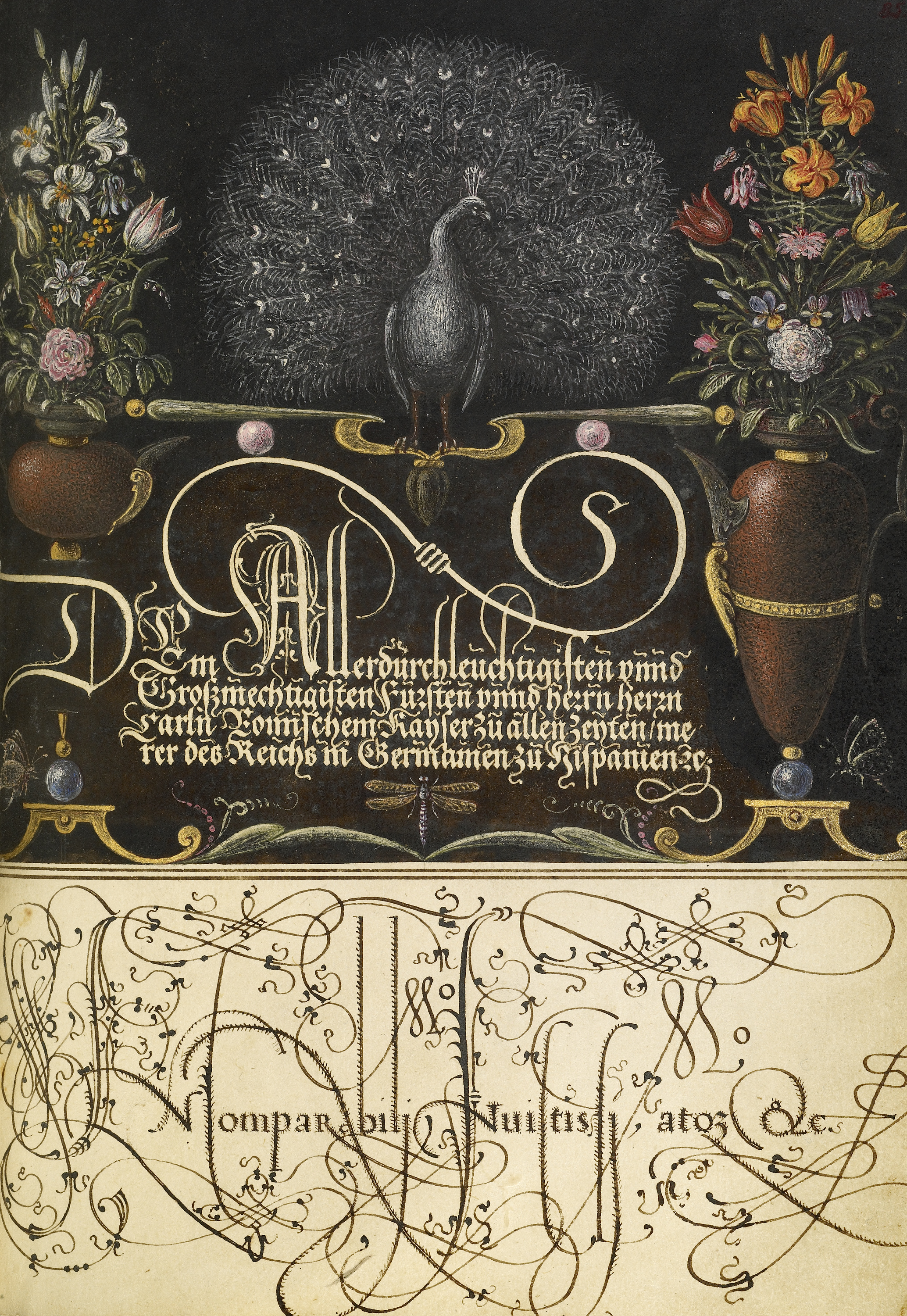
After writing became popular as a means of producing books in the 16th century, with the arrival of the Gutenberg press, calligraphy had somewhat of a revival in Europe. So, from 1561 to 1562, Georg Boeskay, the Croatian-born secretary to the Holy Roman Emperor Ferdinand I created this manual in Vienna. Thirty years later, Emperor Rudolph II, Ferdinand’s grandson commissioned Joris Hoefnagel to illuminate Boeskay’s book. With fine illustrations of flowers, fruit and insects, Hoefnagel added unity and balance to the pages of this wonderful book. Toward the end of the book, we have grid designs of alphabets to help calligraphers create their own beautiful writing.
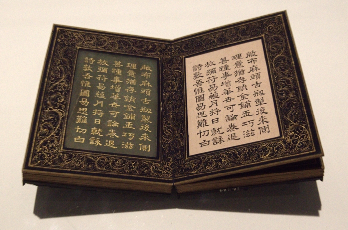
But calligraphy came late to Europe. It was in use in China since the days of the Han dynasty (206 BC to 220 CE) and later spread to Japan and Korea. In fact, in China, it was considered the highest form of art, not merely decorative, but an important means of self-expression. Since the Chinese invention of paper and ink sticks (made from lamp black by burning pine resin or oil), calligraphy was accorded a status equal to that of poetry.
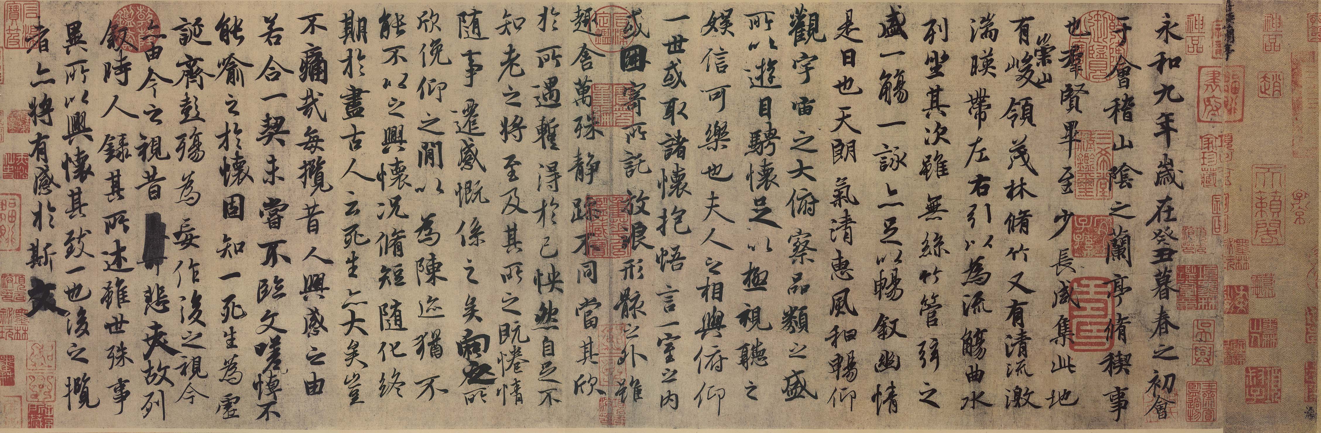
The inkstone, ink, brush and paper were together considered the Four Treasures of the Study. It was indeed a means of communication, but with the highest standards of aesthetic quality. Calligraphy in China had important spiritual dimensions as well, combining the Confucian emphasis on the social and the Daoist emphasis on the natural aspects.
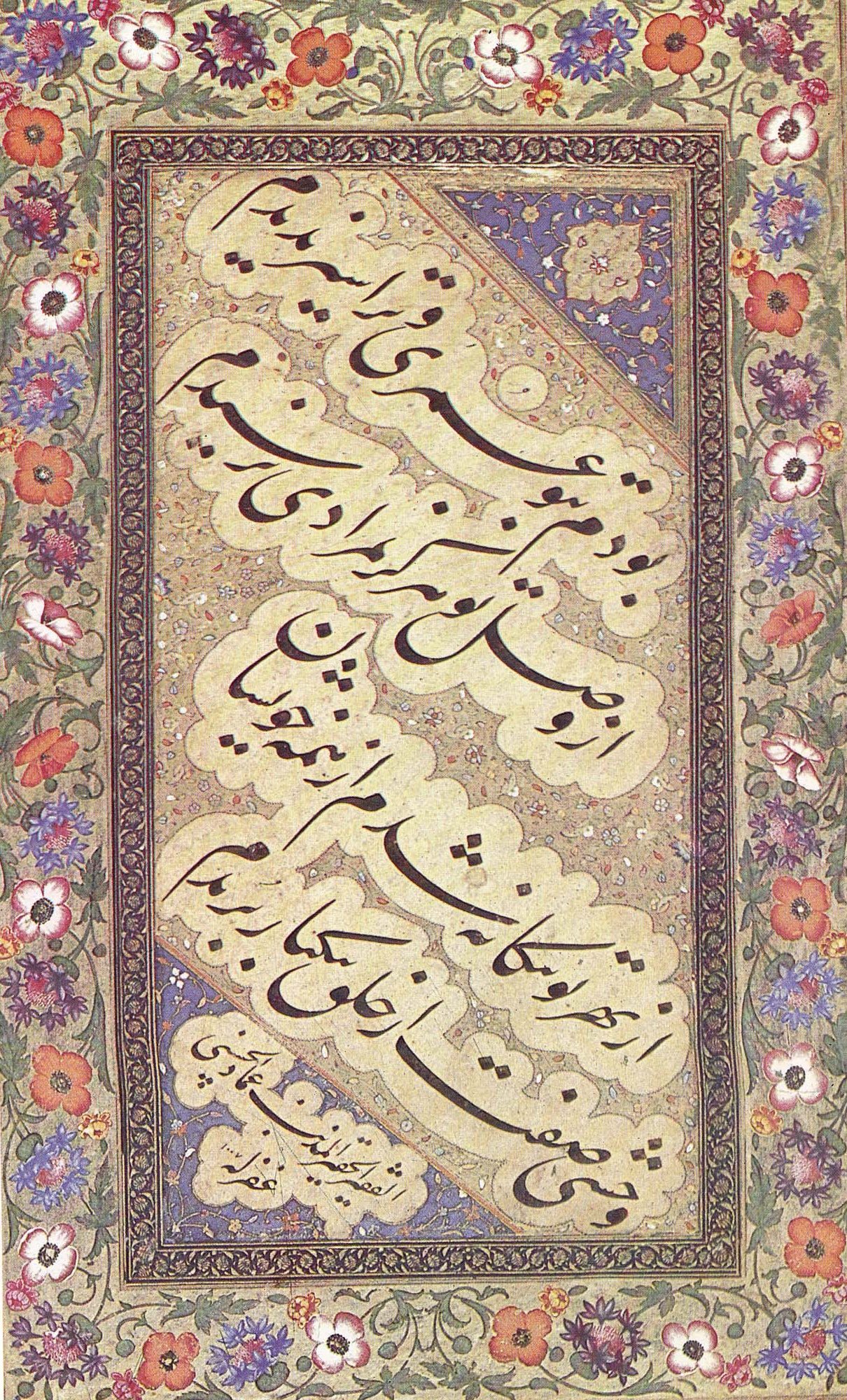
It took until the 7th century for calligraphy to make its way elsewhere in the world. And it was in the Arabic world that it made its appearance, because the Prophet revealed the Quran in Arabic. The earliest calligraphic style was the Kufic, developed in the city of Kufah in Iraq and was based on geometric principles. This angular style gave way to the cursive styles still used today.
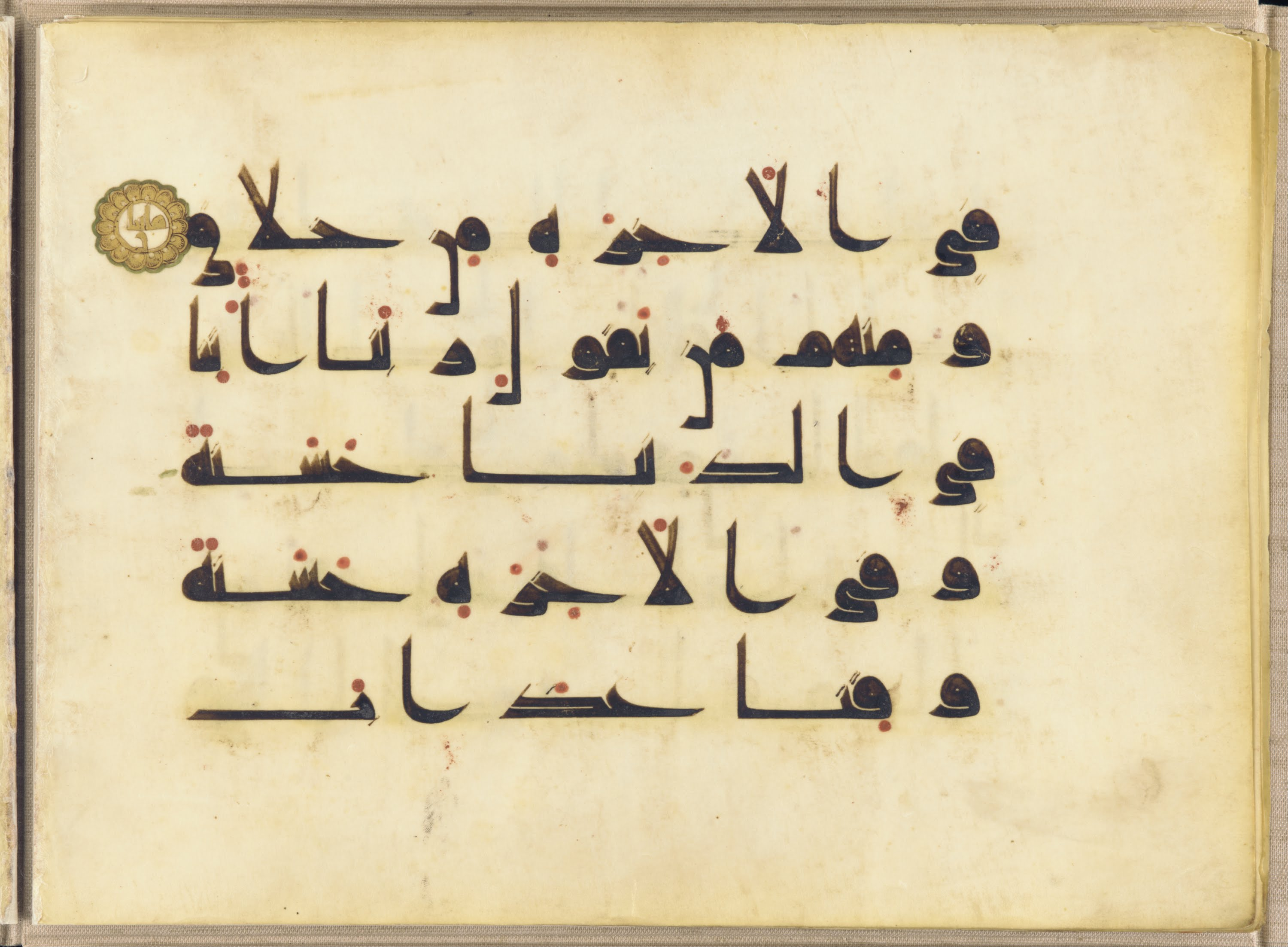
In addition to the Kufic, we have the Naskh (in three variations, Thuluth, Ruq’ah and Muhaqqaq), the Nastaliq, used for Persian literary and non-quranic works, Diwani which was developed in the reign of the Ottoman Turks and Sini, a style developed in China. What an amazing variety that is. And to think that one of the oldest calligraphic inscriptions is The Dome of the Rock in Jerusalem written in mosaic in the year 692CE.
In Western art, calligraphy first appears in the 9th century and it was used for making illuminated Bibles. The most famous of them is the Book of Kells which is at the Trinity College, Dublin. Illuminated in the most extravagant style possible, the 9th century Book of Kells combines Biblical themes with elements of Celtic design and lush colours.

The four most common calligraphic styles developed in Europe are the Rotunda, the Gothic, the Italic and the Chancery. And while calligraphy was used until the 12th century, it went out of favour until about the 16th century when it experienced a kind of revival, mostly as decorative art, it appears.
Which begs the question: why did calligraphy die in the West, when it still thrives in China, Japan and Korea and in the Islamic world? Is it because calligraphy in the East is inextricably linked with language and communication, elevated to the form of an art? Whereas in the West, it seems to have played much more of an ornamental role.
In fact, calligraphy as contemporary art is alive even in India. A highly acclaimed contemporary artist, and Padma Bhushan (one of India’s highest civilian honours) awardee, Ameena Ahmad Ahuja who is known to my cousin uses calligraphy to depict poetry in her art. She is best known for her works which feature the poetry of Rumi, Faiz, Khusro and several others in fantastical beasts’ forms. She has been at art residencies at Columbia University and Harvard University in the US and her work has travelled to many places around the world.
So, why is it that when it comes to the written word, people do not care as much about the aesthetic beauty of it anymore? And what about in my industry of advertising and brand communications? Or maybe I shouldn’t mention a certain faux pas by Nike way back in 1997 here. I don’t know if that was the last time that a calligraphic style of lettering was adopted or if it was even meant to be calligraphy but the results weren’t pretty. Nike had to recall 38,000 pairs of basketball shoes (from a range called Air Bakin, Air Melt, etc) that it had just launched with “Air” written in a calligraphic style resembling flames. To many Muslims around the world, however, the word simply looked like the word Allah written in Arabic.
That shouldn’t mean that calligraphy should be sent to the dustbins of history or of art. I can see uses for it in certain brands of fashion, writing and art instruments, wines and spirits, airlines and hospitality, fragrances, fine dining, books and music and many more industries. New styles and new uses for it in design can be developed.
I hope designers and art directors around the world can revive the art of calligraphy. It would be a pity, indeed, if it faded away from our lives.
The idea of “beautiful writing” ought to be timeless.

Indeed this is beautiful writing!
LikeLike
Thank you. Glad you enjoyed reading it.
LikeLike